PDFs in Drive
Workspace PDF Improvements
MY CONTRIBUTION
UX Lead
I defined UX strategy for PDF improvements. I set high-level direction, collaborated with UXD/VisD, Defined information architecture framework
Delivering 6 major featurescontributed to delivering 6 major features, and designing 6 additional features for future milestones.
IMPACT
1.7 Billion weekly views
CSAT: Increased satisfaction by +20% to 74%
DSAT: Decreased disatisfaction by 7% to 12%
BUSINESS GOALS
Part of Drive’s 2025 strategy is to improve the consumption experience for 3rd party file types, including of PDFs.
CONTEXT
Drive has long supported viewing PDFs but hasn't made consequential updates to its PDF experience in years. Drive is adding table stake features allowing users to fill out forms, easily navigate, edit, and annotate PDFs without leaving Drive.
PDF METRICS
1.7 billion weekly views
1st most commonly viewed file types across Workspace
COMPETITIVE AUDIT
Drive is missing table stake features

APPROACH
Two part approach
Information architecture
Tablestake features
INFORMATION ARCHITECTURE
To accommodate a rapidly expanding roadmap, I designed a scalable information architecture framework. This system ensured that new features could be integrated seamlessly without disrupting the core user experience as the product evolved
TAXONOMY
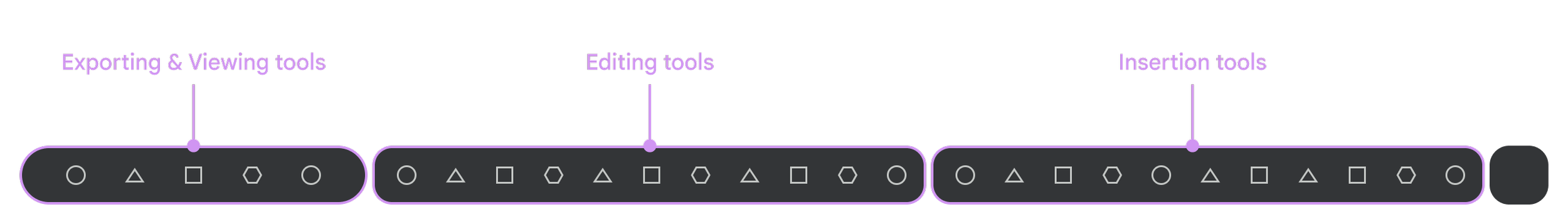
Defined taxonomy into categories and insert tools with a team card-sorting exercise, bridging Google Slides patterns with PDF-specific user needs.

STRATEGIC PLACEMENT
Leveraging Workspace precedents for navigation and collaboration; focusing design optimization strictly on viewing and markup toolbar positioning

CROSS-WORKSPACE ALIGNMENT
I organized an information architecture alignment session with Google Slides. They were also proposing a new IA strategy that I wanted to adopt.

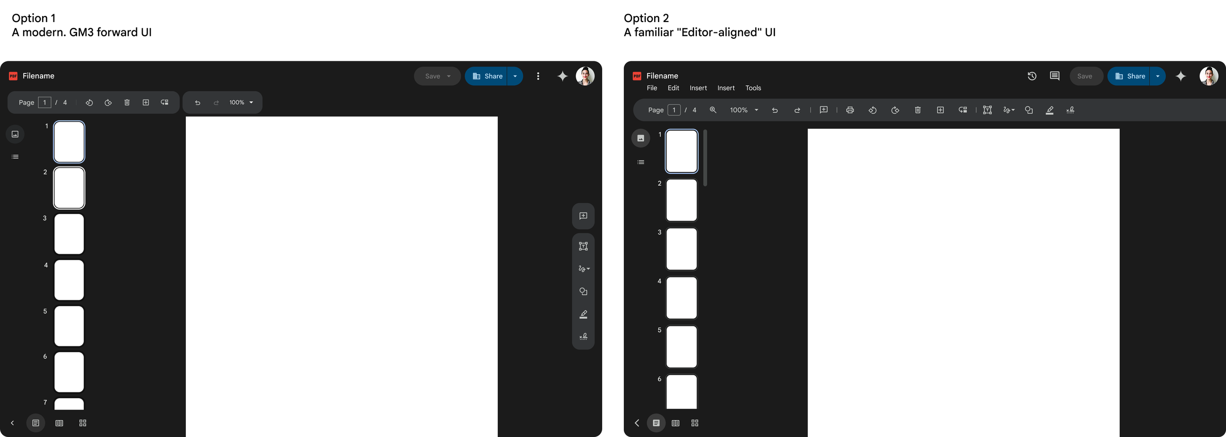
TWO DIRECTIONS
I presented two directions to leadership. We moved forward with
option 2 — a familiar “Editor-aligned” system.
While I personally felt the Editor toolbar was dated and potentially overwhelming, having a familiar system will increase adoption.
PRINCIPLES
Defined principles to help drive product decisions

UNIFIED NAVIGATION SYSTEM
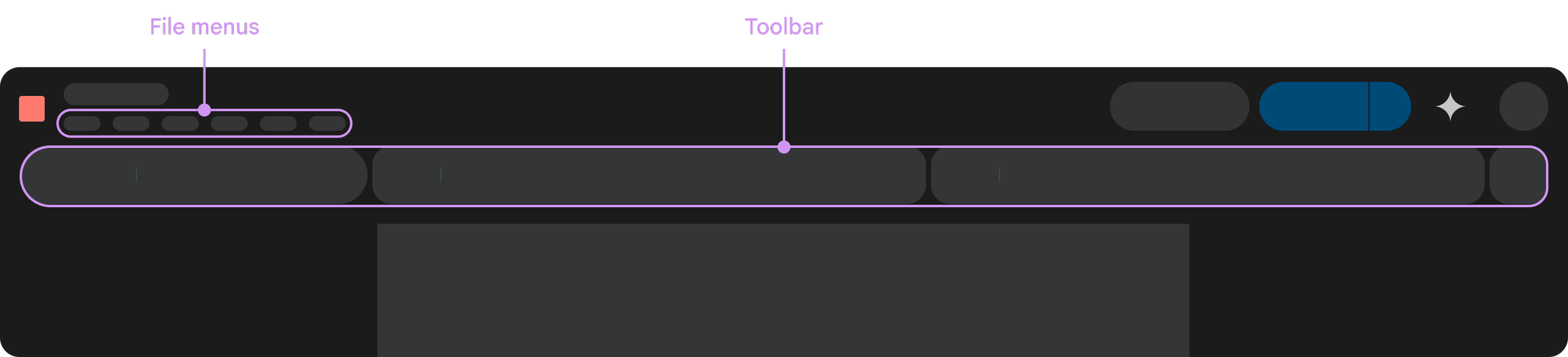
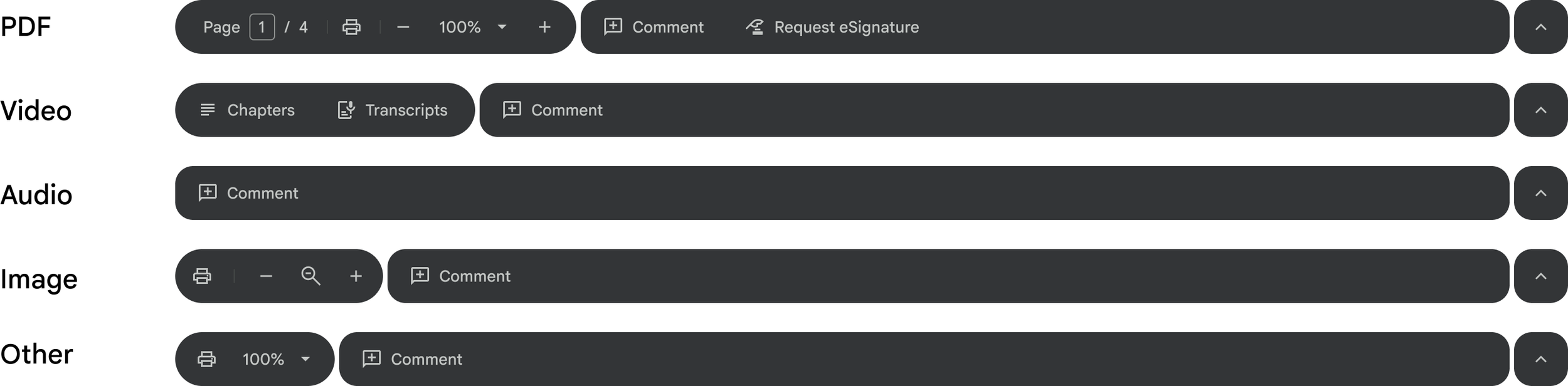
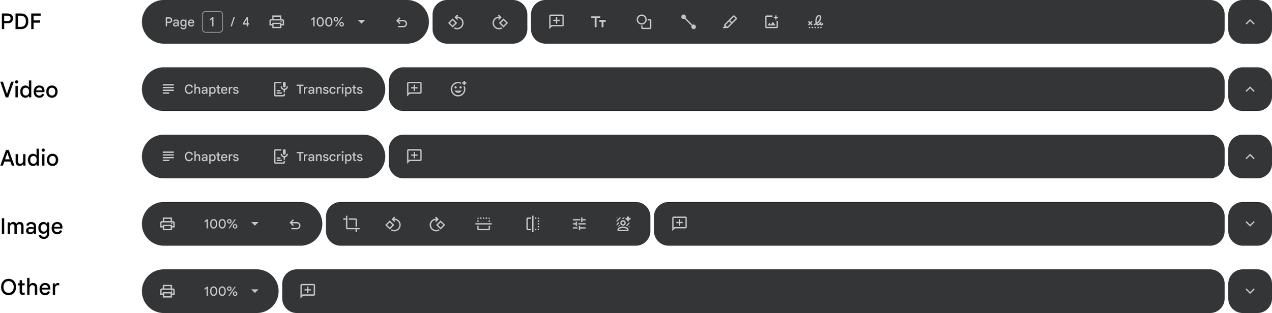
I successfully advocated for a unified navigation system across all files types in the File Viewer, no just PDFs. By standardizing menus and toolbars into a scalable framework, we could deliver a cohesive navigation for third party files types across all of Workspace.
The navigation focused on — files menus & toolbars.
TOOLBAR
Partnering with Video and eSignature UX leads, I led the design convergence of our tools into a standardized system. By aligning with the Workspace design system, I future-proofed the navigation architecture and leveraged familiar mental models to ensure seamless platform consistency.
Short-term
Long-term
FILE MENUS
PROBLEM
The existing file menu had problems to solve
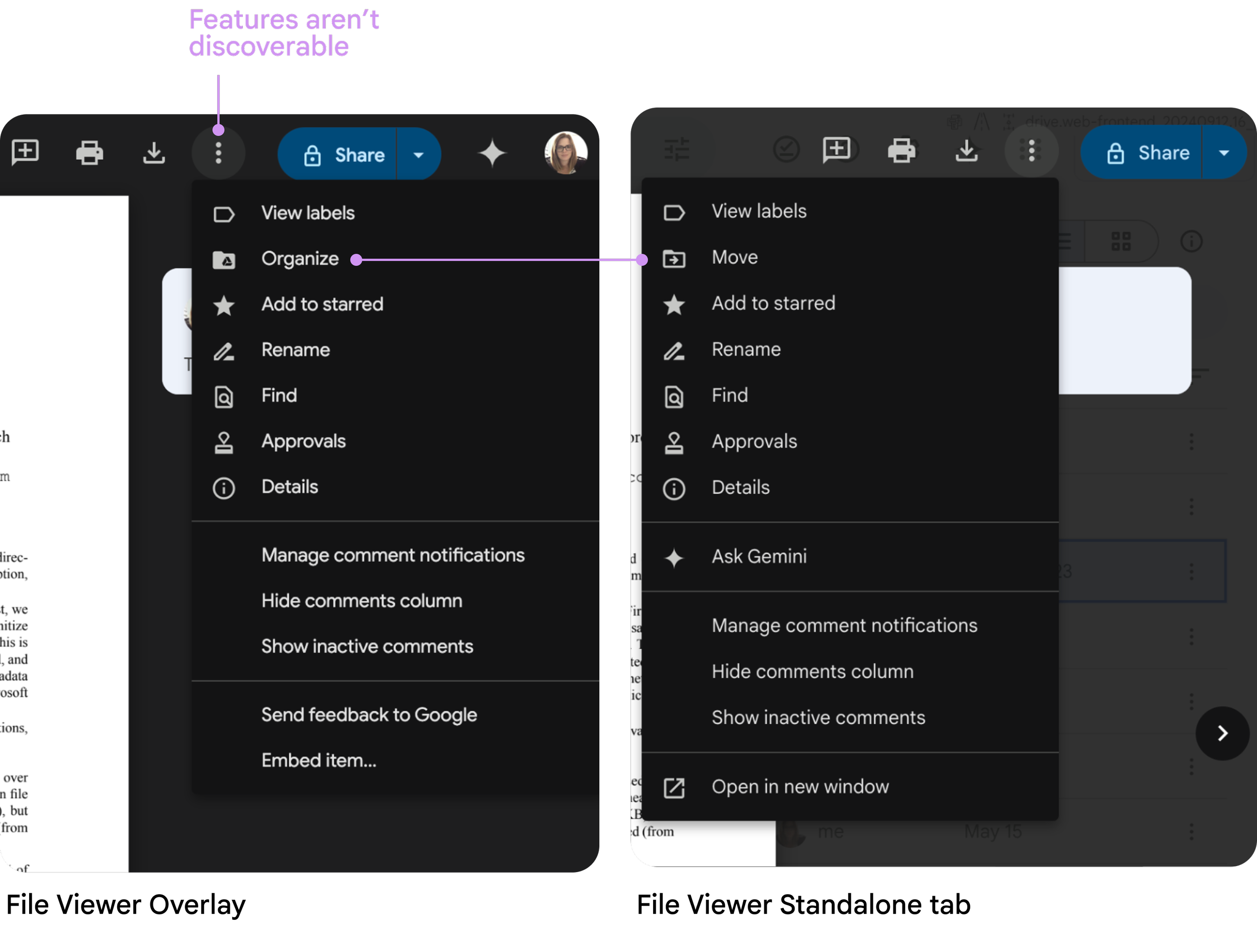
Actions aren’t easily discoverable
There are missing features, like “Make a copy”
The menus are inconsistent across Overlay and Standalone file viewer
AUDIT
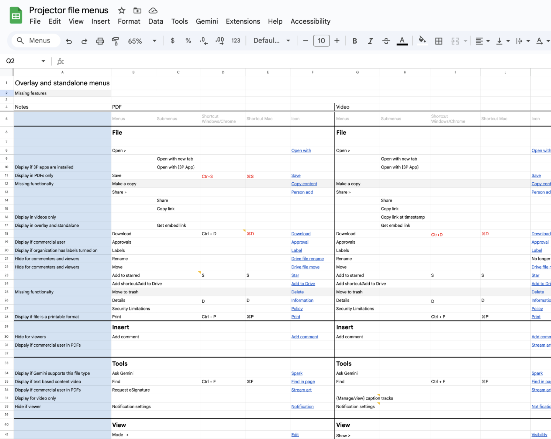
I conducted a comprehensive audit of the File Menu to map cross-surface and file inconsistencies.
From these findings, I established a unified taxonomy—standardizing groupings, iconography, and keyboard shortcuts to ensure a predictable user experience.
DEFINED HIDE/SHOW/DISABLE REQUIREMENTS
Define principles for when to hide, display, or disable a menu items
Hide a menu items if it’s:
A file specific actions e.g. Closed captions
An admin enabled feature e.g. Label
For commercial users e.g. Approvals
If not possible in viewing/editing mode, hide as viewer (TBD)
Disable a menu item if :
The user doesn’t have permission to perform the action on all files
User setting prevents the action e.g. individual rights management —copy, download, print
UTILIZE EXISTING COMPONENT
Utilized existing menu components and Editor’s established information architecture
The Editors recently updated their file menus. To keep navigation familiar we aligned with their IA, language, and icons
Utilized Drive’s existing menu component for the menus
Final design
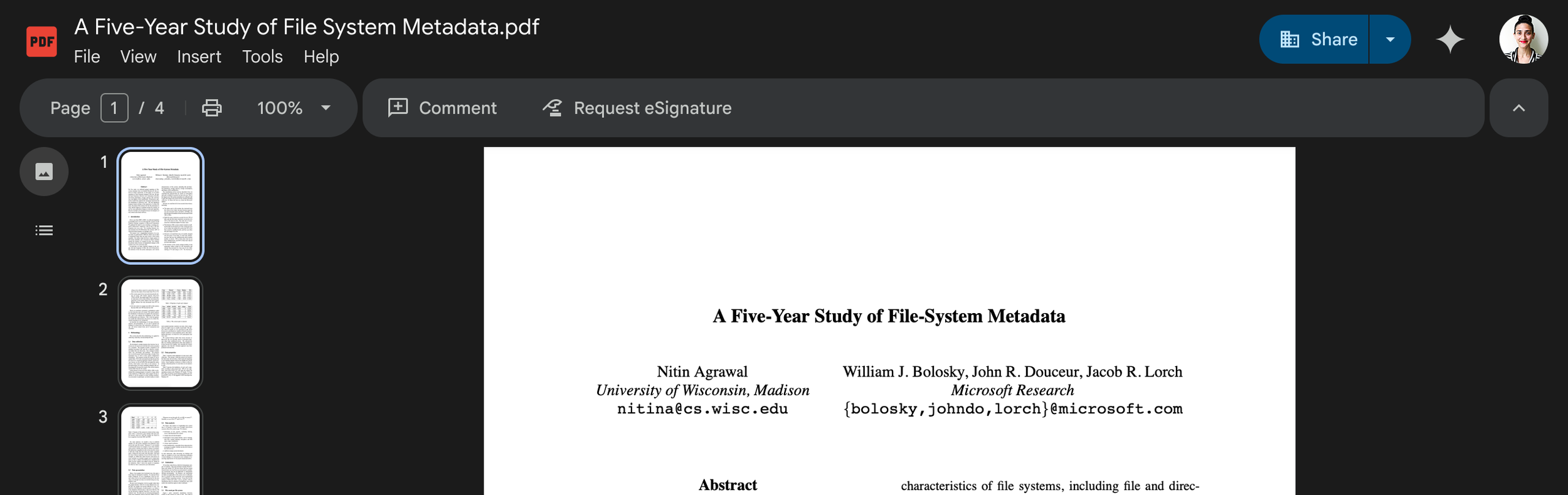
TABLE STAKE FEATURES
To meet an aggressive roadmap by delivering 12 features,
I prioritized ecosystem familiarity over bespoke components.
By aligning core interactions—such as zoom and grid views—with established Workspace and Chrome patterns, we accelerated development while ensuring immediate user proficiency
Table stake features
Two page view
Grid view
Table of content
Thumbnail preview
Zoom improvements
Present mode
Rotate pages
Rearrange pages
Join PDF
Extract PDF
Markup – text, shape, line, signature
Form filling
Design explorations
We explored designs for 12 features to help leadership and cross-functional partners define a multi-year vision and roadmap.

USABILITY FINDINGS
I created a prototype to evaluate opening, navigating, viewing, and editing features.
The findings were positive
Information architecture and almost all icons made sense
100% task completion across almost all features
Only the "Save” button was confusing. All users expected Workspace’s native autosave behavior; assuming the button meant "Save a Copy."
ITERATE ON DESIGN
I iterated on the save button to clarify intention — this experience was understood in a follow up study

CONSTRAINTS
At this point, we learned that engineering underestimated feature development time due to legacy platform limitation, so — we had to reduce scope for MVP.
I partnered with XFN leads to redefine the MVP scope. We prioritized a robust viewing experience to maintain our launch timeline, ensuring a high-quality foundation while strategically deferring editing features.
RE-SCOPING EXERCISE
To determined what features to priority by triangulating user priority, product priority, and eng cost.
MVP included:
Toolbar
Files menus
Table of content
Thumbnail preview
Zoom improvements
Standard form filling
REFINE DESIGN
We refined the visual, motion, and accessibility design
LAUNCH
We launched 6 features and define unified navigation framework to GA resulting in a
1.7B Daily Views
Defined information architecture framework
Delivering 6 major features
CSAT: 20% increased in satisfaction — 74%
DSAT: 7% decreased in disatisfaction — 12%
TEAM