Google Modernize Workspace Video Player
Workspace Video Playback Visual Refresh
Google Workspace had a video primitive to power video experiences across our products — encompassing video recording, editing, sharing, and playback. The goal was to ensure a cohesive experience for our users, accelerate innovation across our product teams, and build for the future of work.
UX LEAD
Defined a multi-year UX Video Playback Strategy to modernize the Workspace Playback experience — UI refresh was the first project
Successfully secured buy-in from Workspace leads to prioritize a visual update ahead of other critical features
Drove alignment across Workpsace team to ensure we built a scalable system
IMPACT
Collaborated with designers across Workspace, I contributed to, led and directed the delivery of 9 major features, resulting in:
~84M weekly views
Increase CSAT from 56% to 75%
Decreased DSAT from 21% to 15%
CONTEXT
Workspace has a video primitive to power the video experiences across Google Workspace. The Editors create a new video editing tool (Vids), Meet is improving their asynchronous meeting experience, and Drive is updating the video player to better support all cross-product journeys. These updates are all part of Workspace's effort to make video a more seamless and integrated part of Google Workspace.
RESEARCH
Users were not satisfied with the current playback experience
76% of users expressed frustration due to:
Reliability buffering, processing latency
Looking like YouTube confuses users
Feature discoverability
CSAT 56% • DSAT 30%
“Looks like YouTube but doesn’t entirely behave like it”
PROBLEMS
Because the Workspace player looked like YouTube, users expected it to act like YouTube
However, the underlying API lacked essential features—specifically chapters and preview scrubbing—with no roadmap for improvement
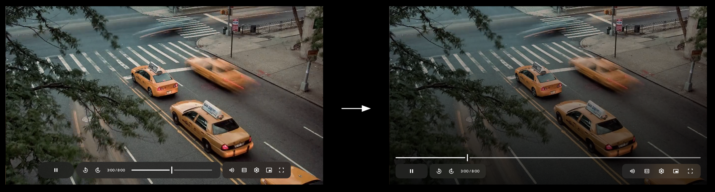
The player was dated and didn’t align GM3 standards, creating a disjointed user experience
Plus, Google Vids was creating a player that diverged from the Drive experience

OPPORTUNITY
I recognized this user pain point and successfully secured buy-in from Workspace leads to prioritize a visual update ahead of other critical features
Ensuring dedicated resource allocation and cross-product alignment
GOAL
Make video a hero journey across Workspace by delivering a unified async video experience
APPROACH
BUilding THE FOUNDATION
My initial approach focused on establishing the framework for the new player. I defined the foundational components, building blocks, and interactions.


COMPETITIVE ANALYSIS
We conducted a competitive analysis to understand feature gaps and industry standard patterns.
CROSS-WORKSPACE DESIGN JAM
I organized and co-facilitated visual design brainstorm session to drive alignment and foster collaboration across Drive, Vids, Workspace Design Systems, and Meet.


Our team defined two direction and wanted to move forward with direction 1.

Direction 1 - Contained timeline and controls, Direction 2 - Open timeline
PROTOTYPE
I created a prototype to evaluated the usability of direction 1.

FINDINGS
The findings were positive.
Majority of the users liked the new direction of the video player! And thought it looked “modern” and “sleek”
Creators were agnostic about the appearance and care more about collaboration and performance
Some felt the controls gets in the way of the video
Nearly a third of the participants mentioned the new design had some form of familiarity to Apple and its video player on Mac
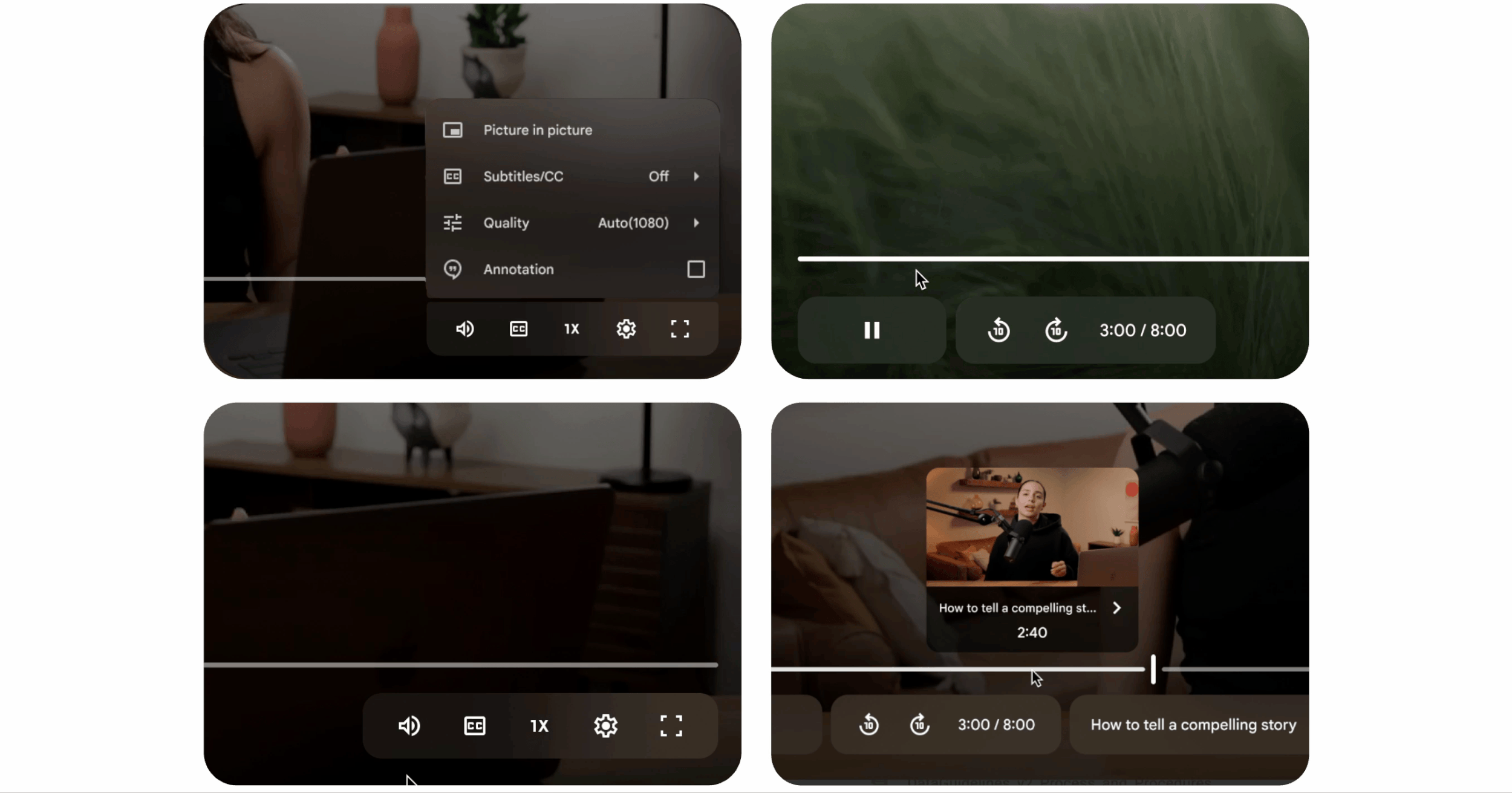
The video hover preview on Drive was a hit!
DESIGN SPRINT
Our team wanted to move forward with Direction 1, but I hypothesized that wouldn’t scale. As a result, I organized and facilitated a cross-Workspace design sprint to ensure the new design worked well with upcoming features impacting the video player
Chapters
Comments
Reactions
As we explored and evaluated these journeys during the sprint, we discovered issues with the timeline and decided to remove it from the container.
WHAT WE LEARNED
We learned that the alternative direction was better suited for upcoming features. We secured leadership buy-in to pivot direction.

DEFINED PRINCIPLES
Uniquely Workspace - Not YouTube! GM3
Adaptable Interface - same atoms everywhere, responsive to every device
Video first = user first – UI restructure to put video first, improved accessibility
Empower collaboration & productivity – Comments & Chapters
REfINE
We moved forward with the open timeline and refined the visual and motion design.
post-launch metrics
Satisfaction stays the same
Dissatisfaction decreases by 10%
Perception of modernity went up 20%
No increase in latency
WHAT PEOPLE SAID
“I have a good experience with viewing videos in Drive of late. In fact, I like the new update, the look, espeically with the function of letting you pick the playback speed”
“The service has been impeccable lately! This [player] looks so cool. Keep going!”
“I like it! It’s not like YouTube anymore; I think it works better and tt reflecs a new personality, is modern, and could improve the experience for usres. I really like it—good job!”
TEAM
UX Lead - Me
Visual Designers - Yong Kim (WS Design System), Zoë Knight (Drive)
UXE & Motion Designer - Josh Greco (Drive)
Interaction Designers - Dan Littlewood (Meet), Nida Hameed (Editors), Ron Zhang (Drive Mobile)
Research - Prasanna Muthukumar